Biofru

dried fruits

client snapshot:

biofru is a dried fruit brand built on simplicity, health, and clean living. made with organic ingredients and mindful production, their products are crafted for people who care about what they consume. the goal? a brand that feels as fresh and trustworthy as the product inside the bag.

the challenge:

biofru came to us with a solid product idea – but no name, no identity, and no visual direction. in a market full of generic packaging and forgettable names, they needed a brand that could break through the noise while staying true to its natural roots.

our push:

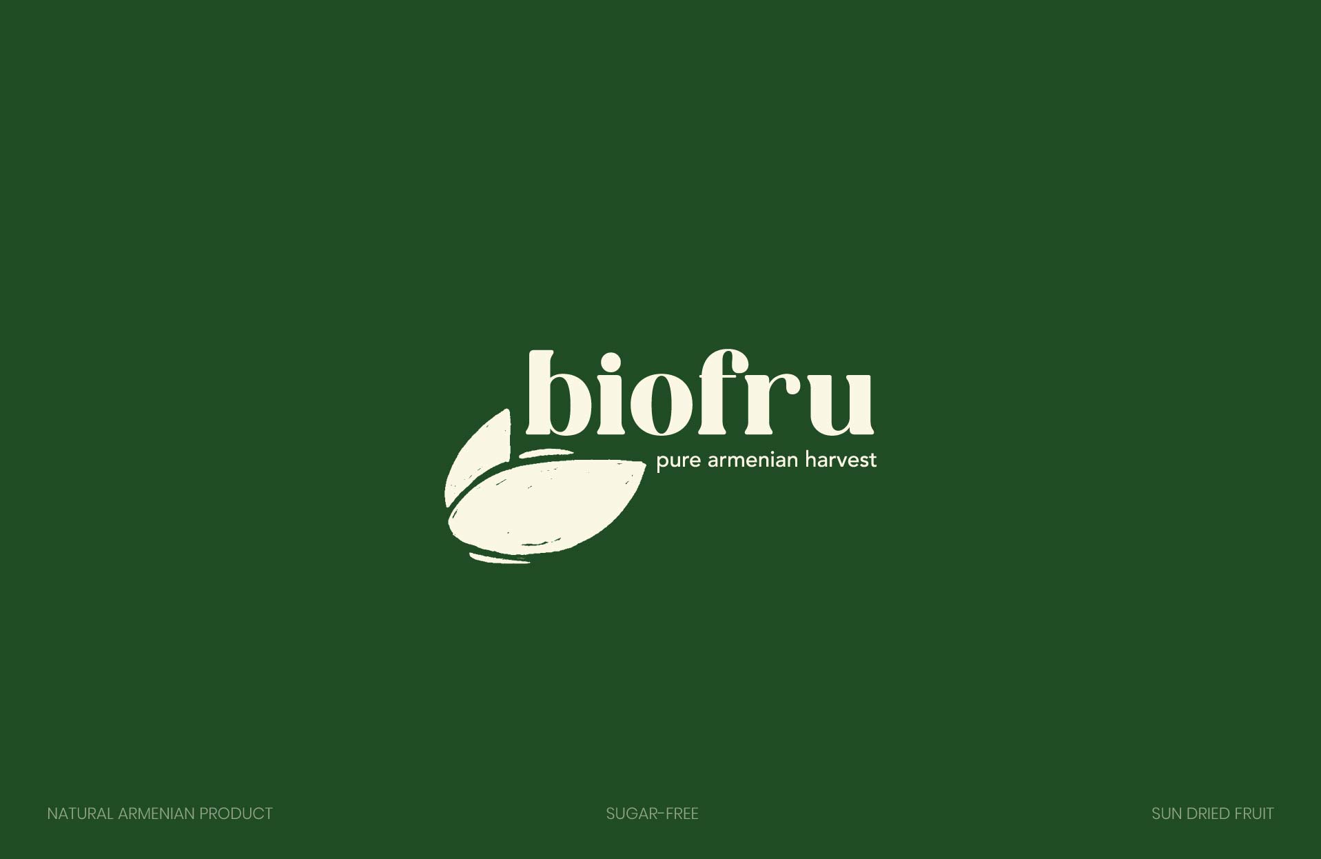
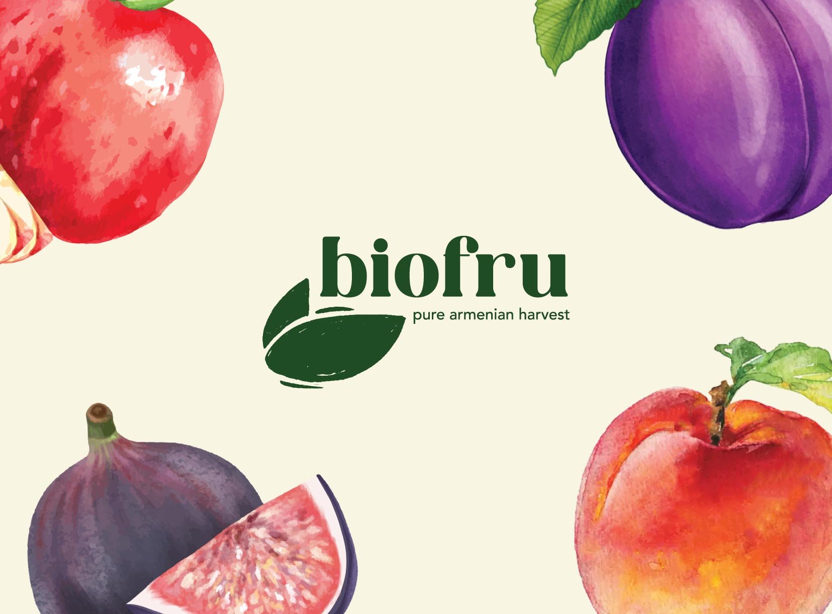
• developed the name “biofru” to reflect organic values in a short, modern way
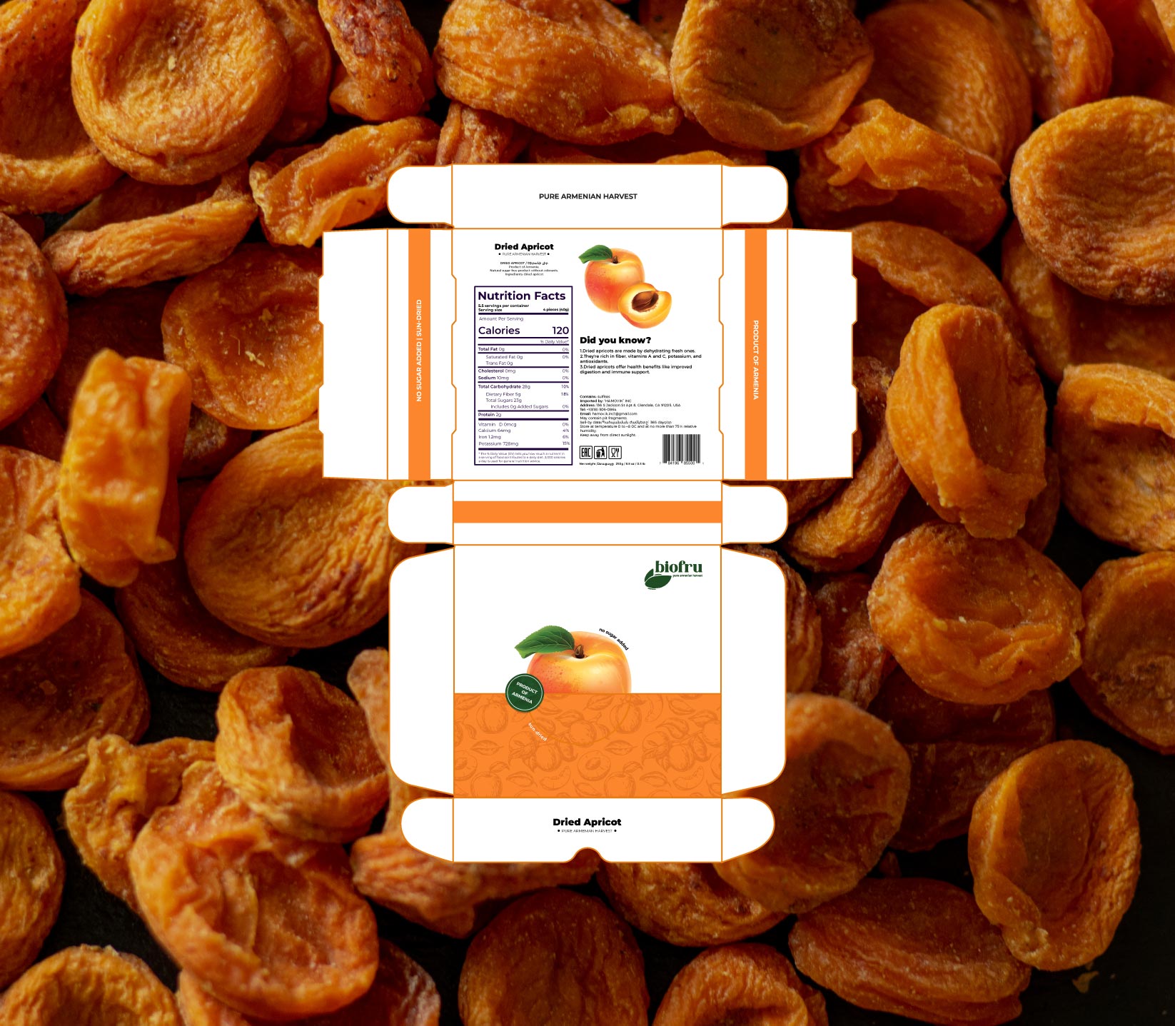
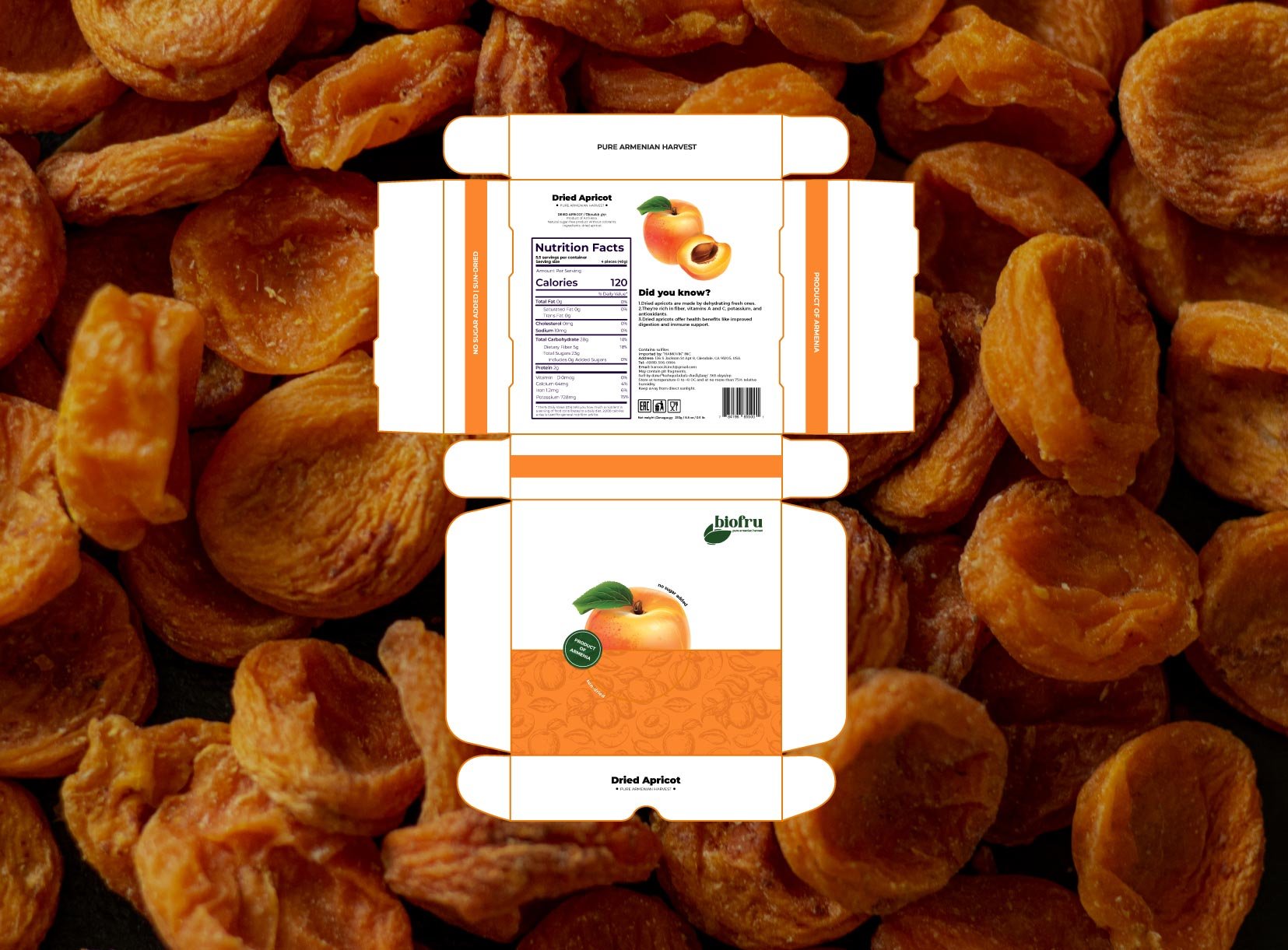
• created a full brand identity system from scratch
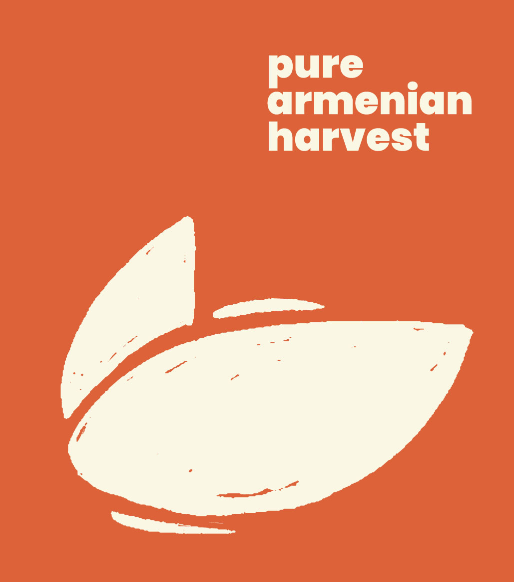
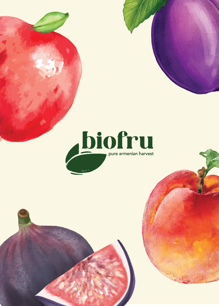
• designed a clean, leaf-inspired logo symbolizing freshness and wellness
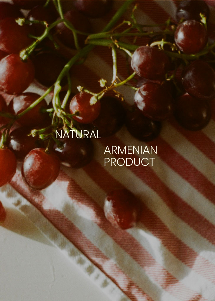
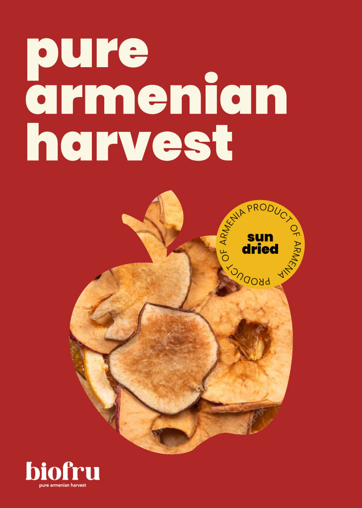
• built a color palette of deep green, dark yellow, and warm brown to evoke vitality and earthiness
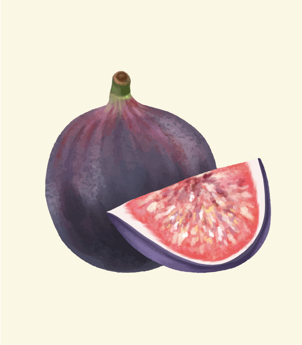
• crafted packaging for a full dried fruit line: prunes, apricots, persimmons, peaches, victoria plums, apples, and figs

the impact:

• launched a brand that looks as fresh and real as the product it sells
• delivered a full visual system that connects with modern, health-conscious consumers
• positioned biofru to stand out in a crowded space with clarity and confidence

client feedback:

you didn’t just give us a brand – you gave us the words, the look, and the vibe to grow with. it finally feels like biofru exists for real, not just in our heads.
we built biofru from the ground up – starting with the name, then crafting a full identity and packaging line that communicates freshness, quality, and simplicity. in a cluttered health food space, biofru now stands out with clarity and intention.

got interested?

let's push your business together

get in touch