Donfesto

pasta

client snapshot:

donfesto is a premium food brand offering pasta, flour, and breakfast flakes made from the finest natural ingredients. inspired by the spirit of dionysus – the greek god of celebration, wine, and abundance – the brand aims to bring warmth, love, and culinary bliss into every home. they came to us to build a brand identity that would translate this vision into packaging and shelf appeal.

the challenge:

despite having high-quality products, donfesto lacked a cohesive visual identity. their packaging didn’t reflect the rich, natural taste or the brand’s commitment to healthy living and sustainability, making it difficult to stand out in the crowded retail food market.

our push:

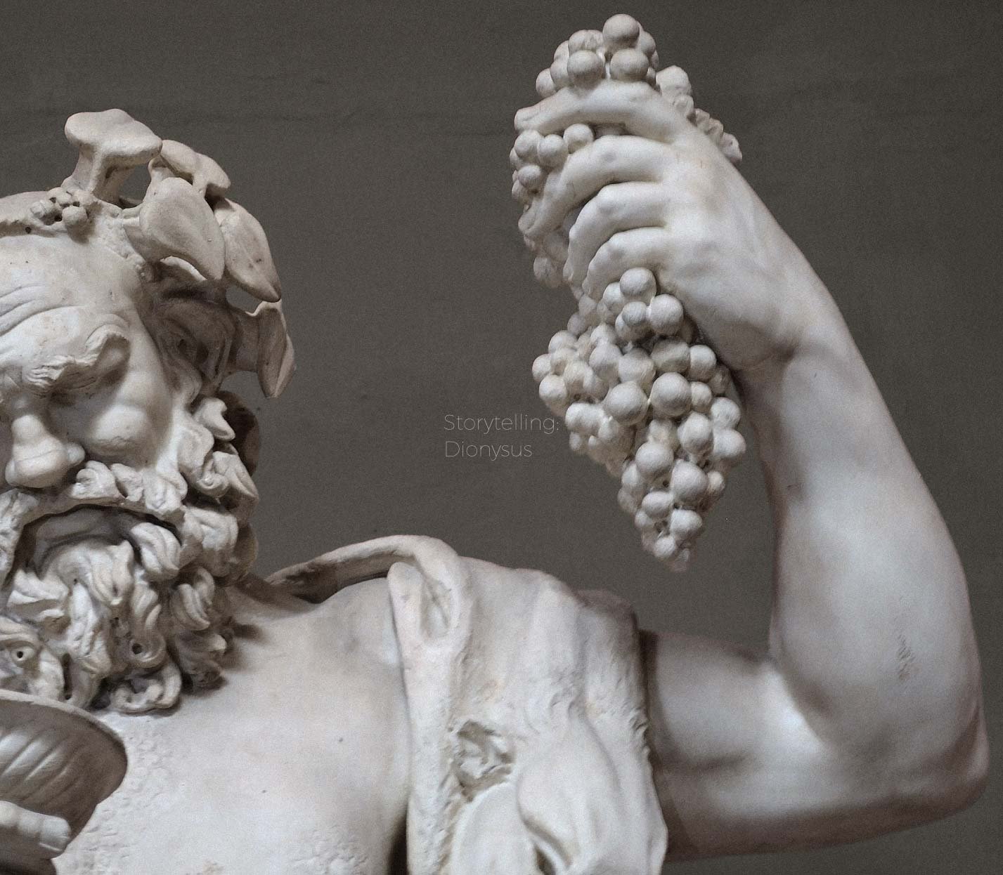
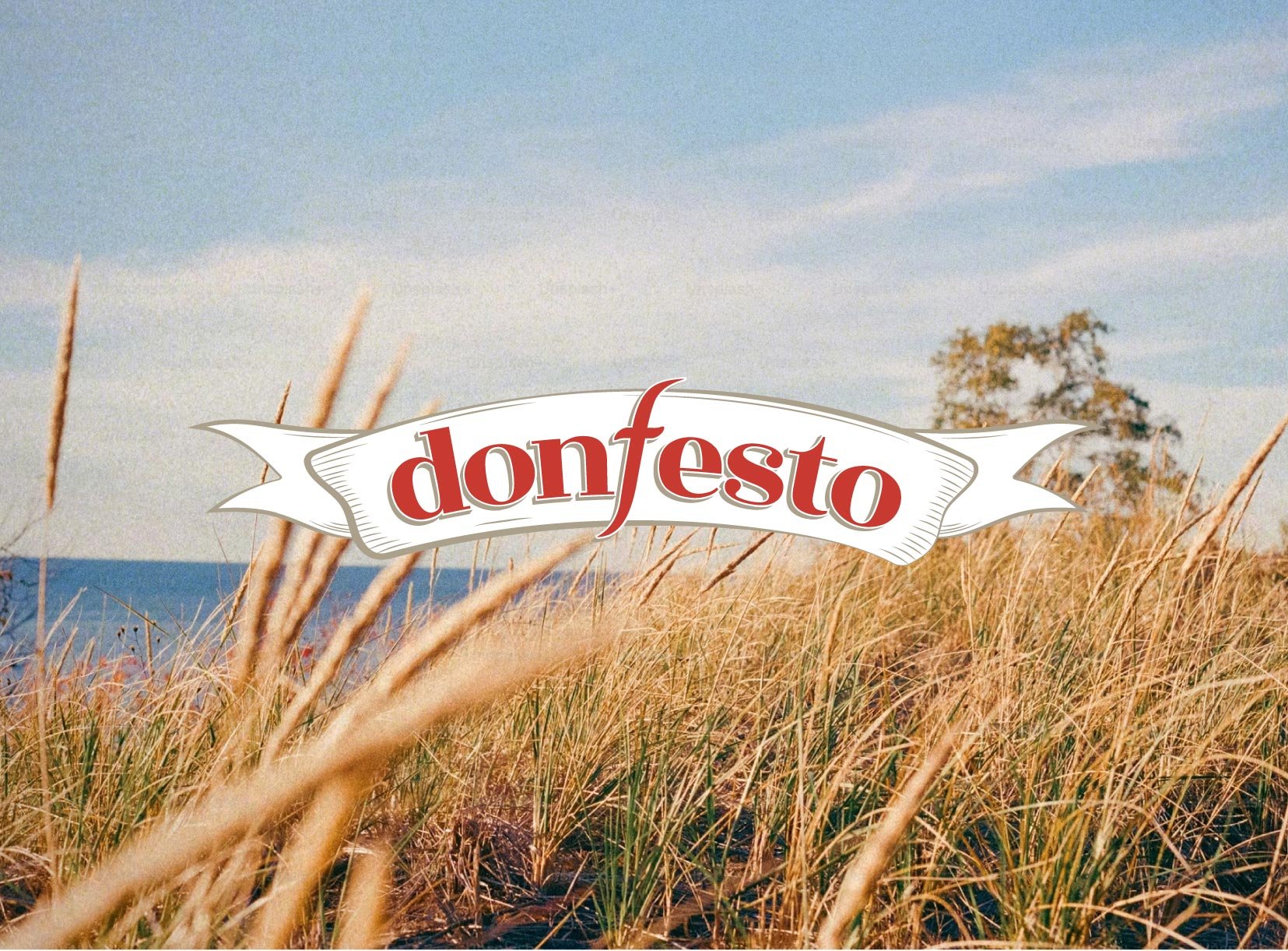
• developed a full storytelling-driven brand concept tied to the donfesto name and philosophy
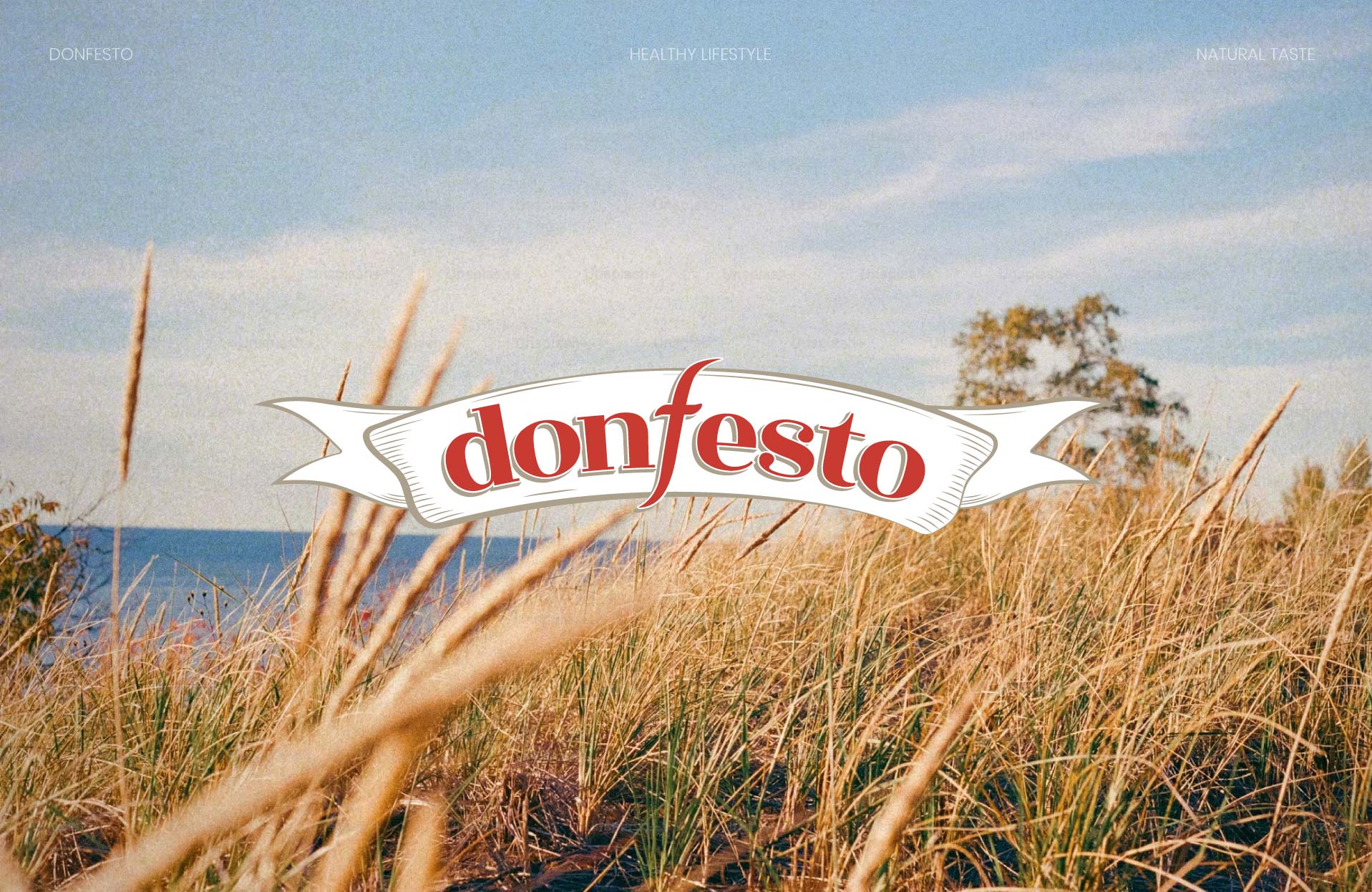
• designed a logo symbolizing conscious choices, natural lifestyle, and environmental care
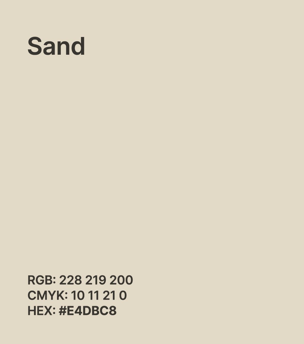
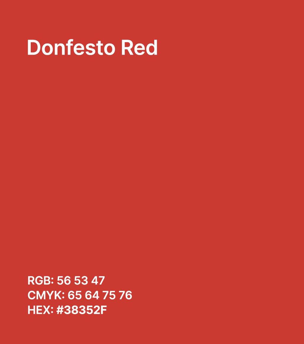
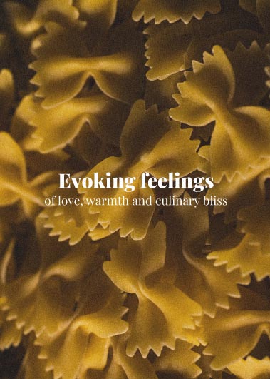
• built a color palette inspired by vibrant flavors, authenticity, and gourmet quality
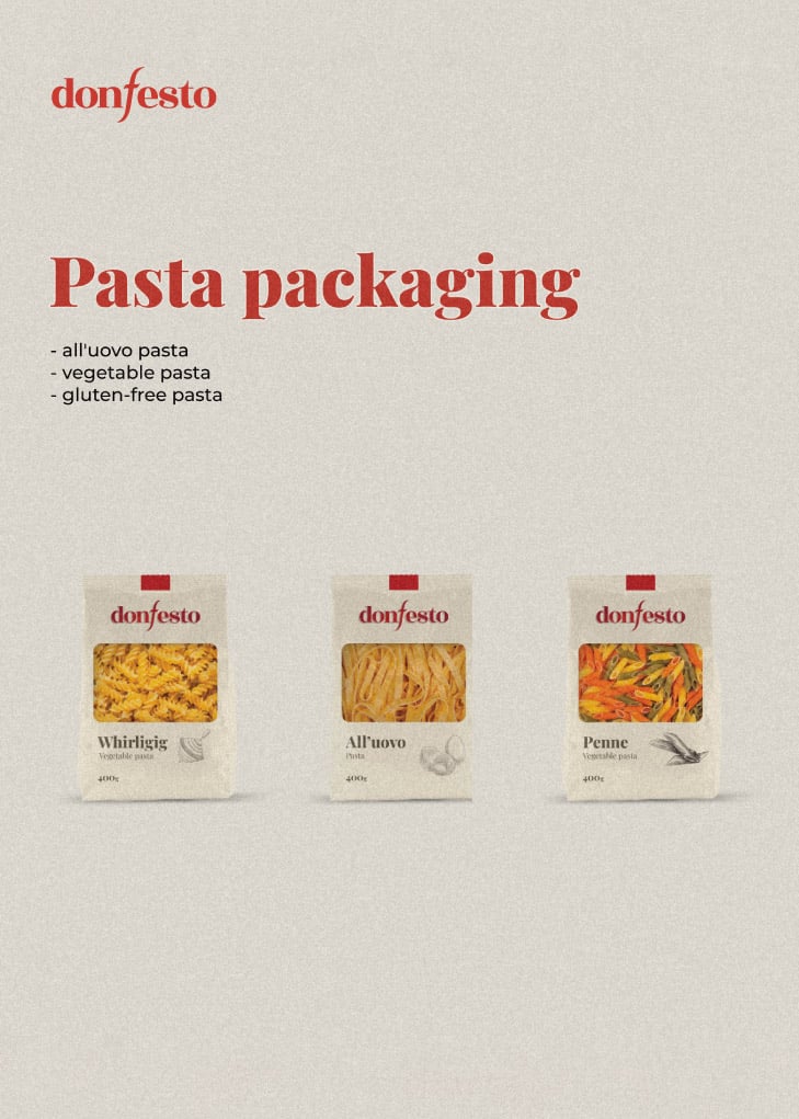
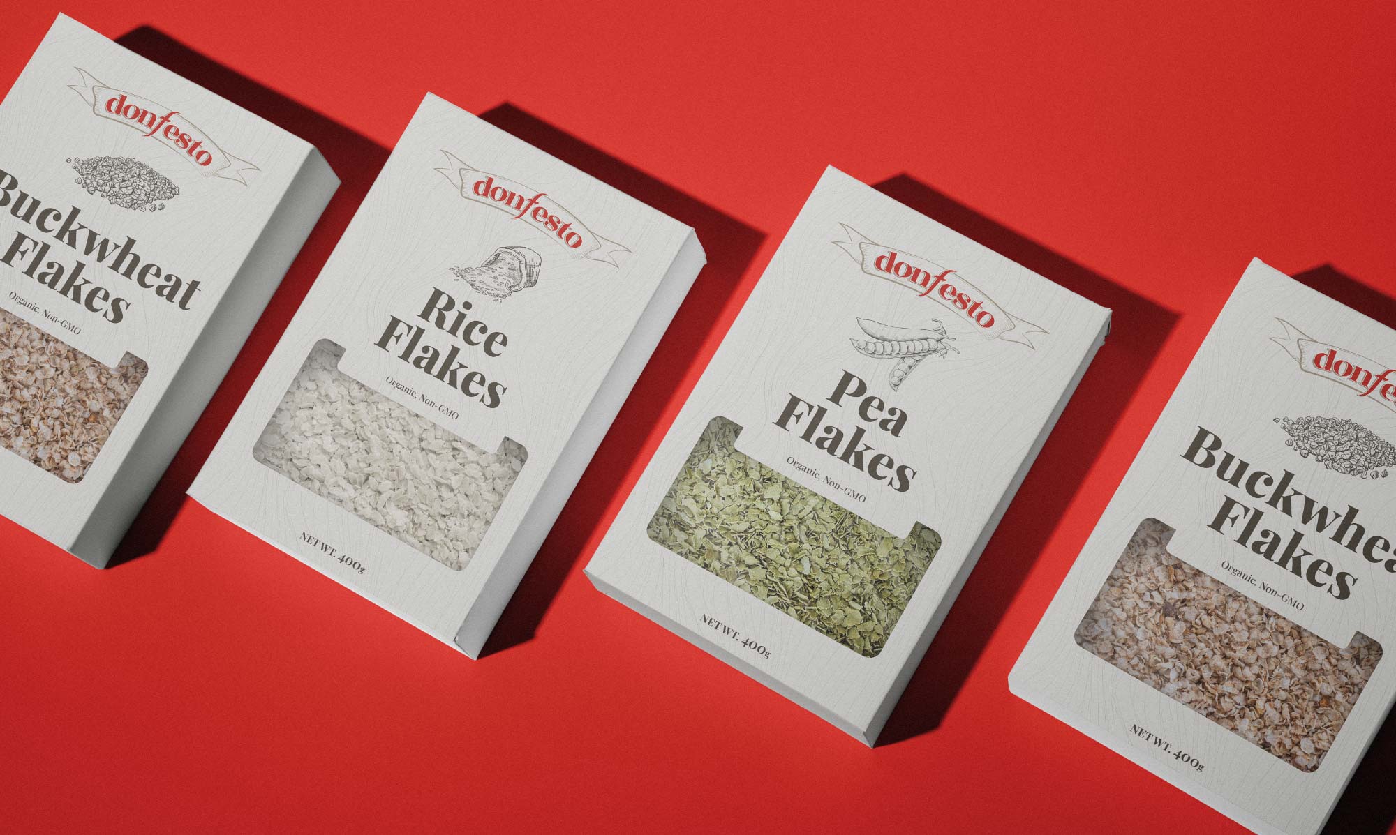
• created packaging designs for the full product line:
 - pasta: all’uovo, vegetable, and gluten-free varieties
 - flour: whole-wheat and gluten-free
 - flakes: buckwheat, rice, and pea flakes

the impact:

• delivered a visually striking brand system that connects with modern consumers
• created packaging that stands out on shelves while communicating natural ingredients and quality
• provided donfesto with a complete, consistent visual language across product lines

client feedback:

push brought our vision to life with a brand and packaging design that perfectly reflects the essence of donfesto. the new look has made a huge difference in shelf recognition and customer connection.
through bold storytelling and thoughtful design, we helped donfesto evolve from a product line into a lifestyle brand. now, every package tells a story of taste, quality, and conscious living.

got interested?

let's push your business together

get in touch