Mama Killa's bakery

bakery

client snapshot:

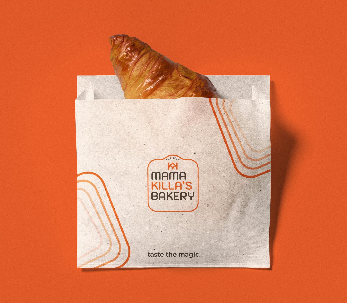
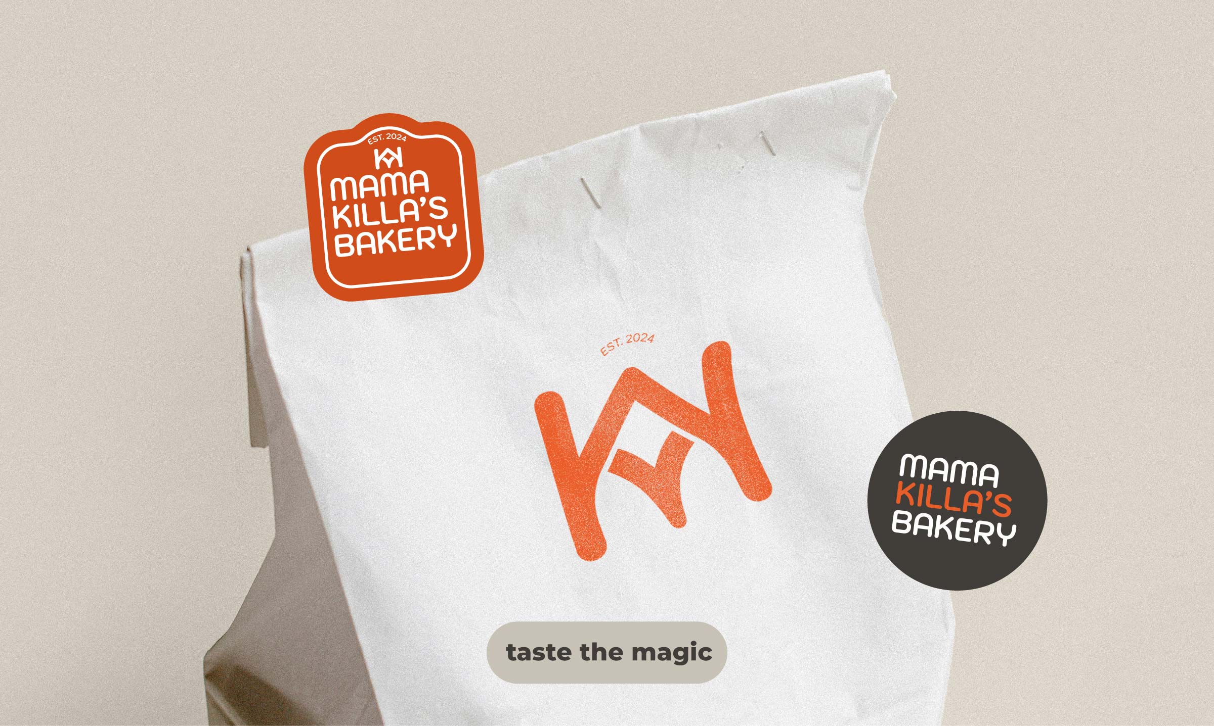
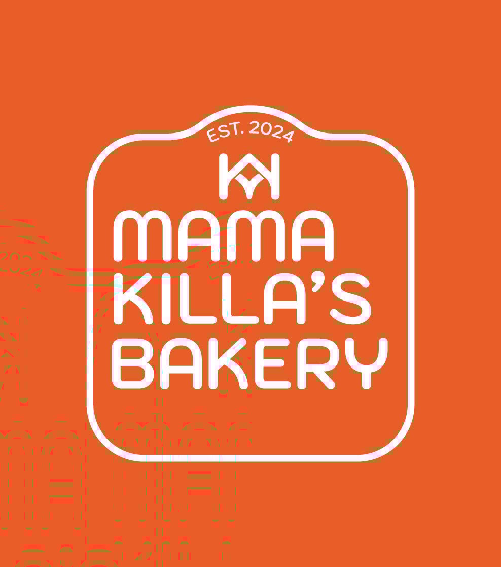
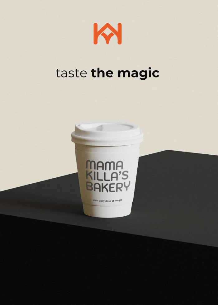
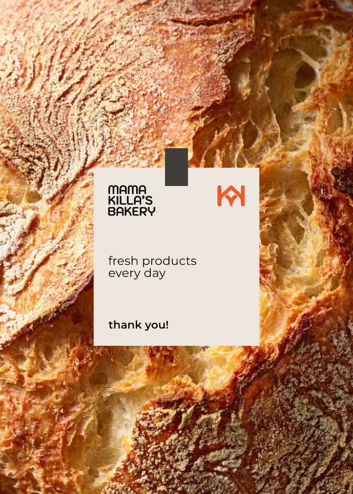
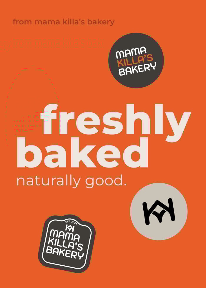
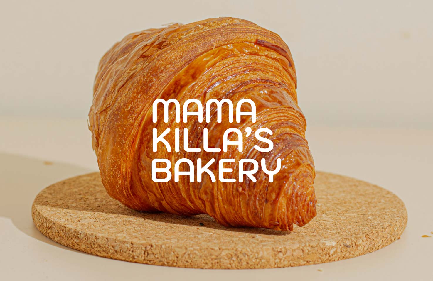
mama killa’s bakery is a small-batch, artisanal bakery named after the incan goddess of the moon. known for its naturally sourced breads and pastries, the brand already had a visual identity – it just needed help translating that vibe into physical, customer-facing materials.

the challenge:

despite a strong concept, mama killa lacked consistent packaging, merch, and product presentation. they needed branded assets that felt as warm and soulful as their goods – without sacrificing practicality.

our push:

• brought the brand into the physical world with cohesive customer-facing materials
• designed coffee cups with warm, illustrative touches
• created dessert boxes that balance charm with structure
• developed rustic, premium bread and baguette sleeves
• crafted branded takeaway bags for a consistent look
• designed juice and yogurt packaging to expand the product line
• delivered functional, on-brand uniforms for the team

the impact:

we created a full set of materials that made the brand feel thoughtful and cohesive at every touchpoint – from packaging to uniforms. everything was crafted to reflect mama killa’s earthy, handmade charm.

client feedback:

you helped bring our brand to life beyond the logo. everything – from bread sleeves to uniforms – feels exactly like us.
Mama Killa’s Bakery monogram logo with 'EST. 2024' on black background.
Mama Killa’s Bakery logo on orange background.
we brought mama killa’s soulful, handmade vibe into every detail – from cups to bread sleeves to team uniforms. the result is a tactile, beautiful brand experience that feels as thoughtful as the food itself. packaging isn’t just functional – it tells a story.

got interested?

let's push your business together

get in touch