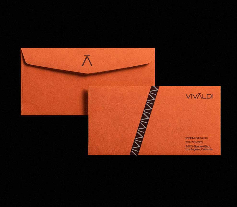
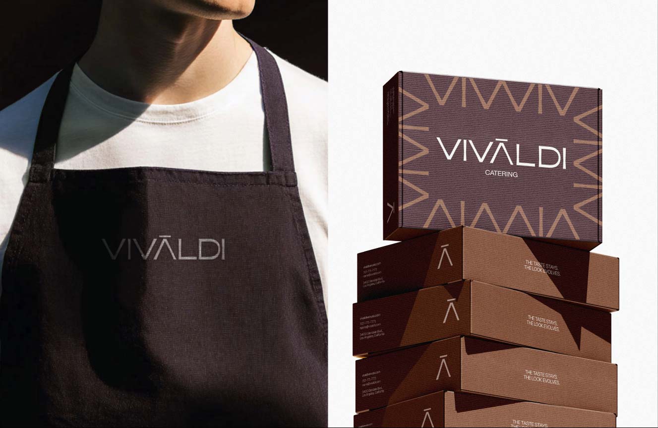
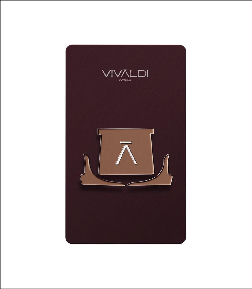
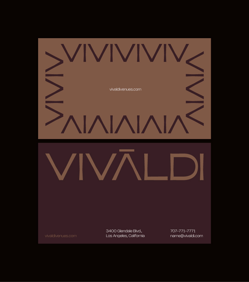
the previous brand leaned heavily on white, black, and gold – visually premium, but distant and generic for a food-first business. it lacked warmth, craft, and sensory appeal, and there was no scalable system for packaging, staff materials, or social media. vivaldi needed a brand that felt elevated yet human – one that could clearly express the art of serving across both physical and digital touchpoints.