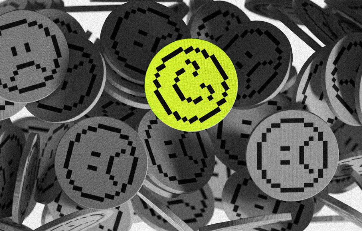
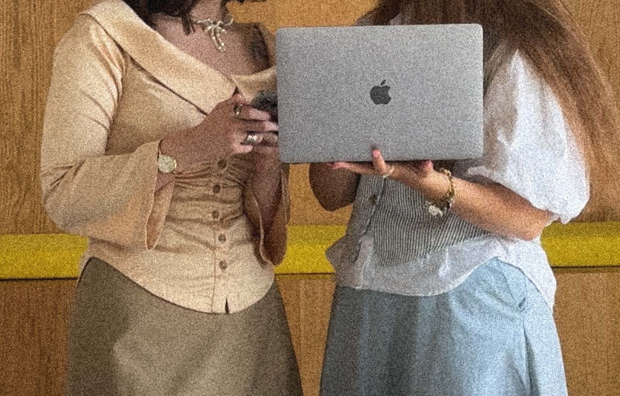
too many businesses think branding = a nice logo and a few colors. but here’s the truth: a logo is just the handshake. branding is the full relationship.
the brands people remember – and trust with their money – don’t just look good. they feel consistent, they tell a story, and they shape experiences.
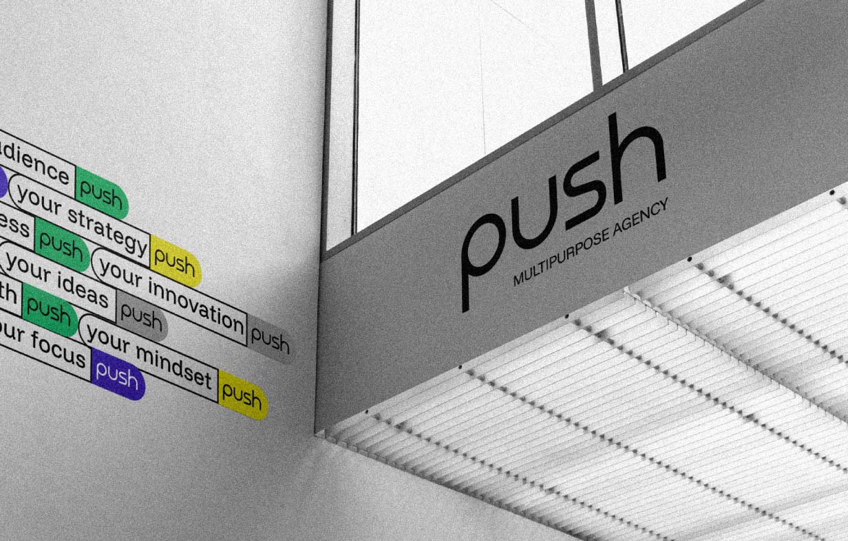
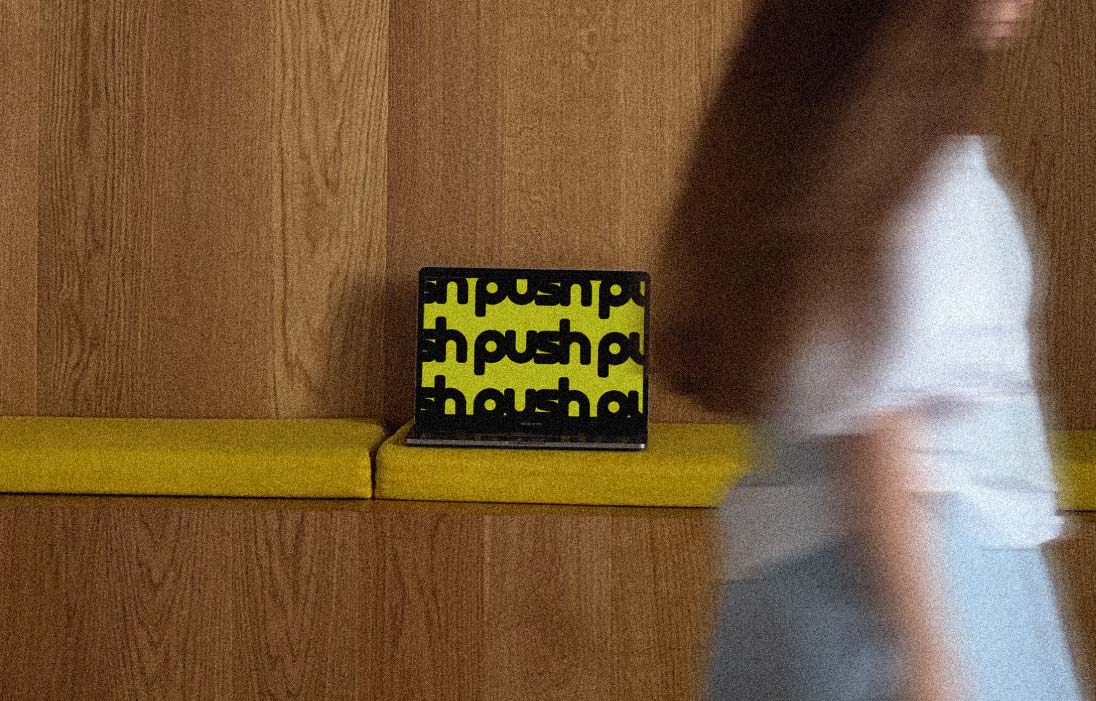
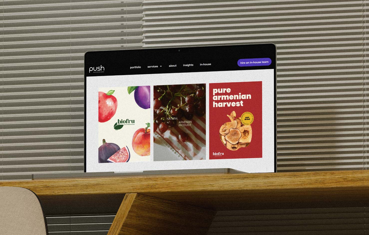
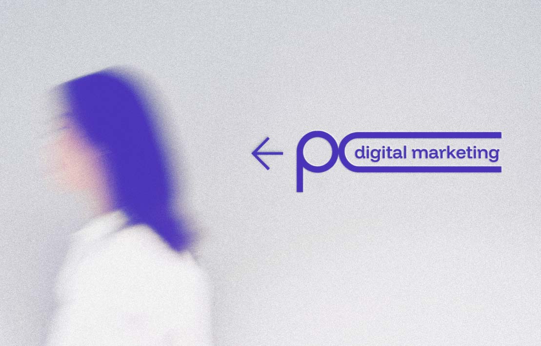
at push, we’ve built brands across industries, from beauty salons to construction companies. and every time, the same lesson holds true: branding is the difference between being seen and being unforgettable.
1. branding is identity + story + experience
a logo introduces you. but it’s everything around it that makes people stay:
- identity: the visuals, tone, typography, and consistency.
- story: why your brand exists, what it stands for, and what makes it different.
- experience: how people interact with you – online, offline, and everywhere in between.
without all three, a logo is just decoration.
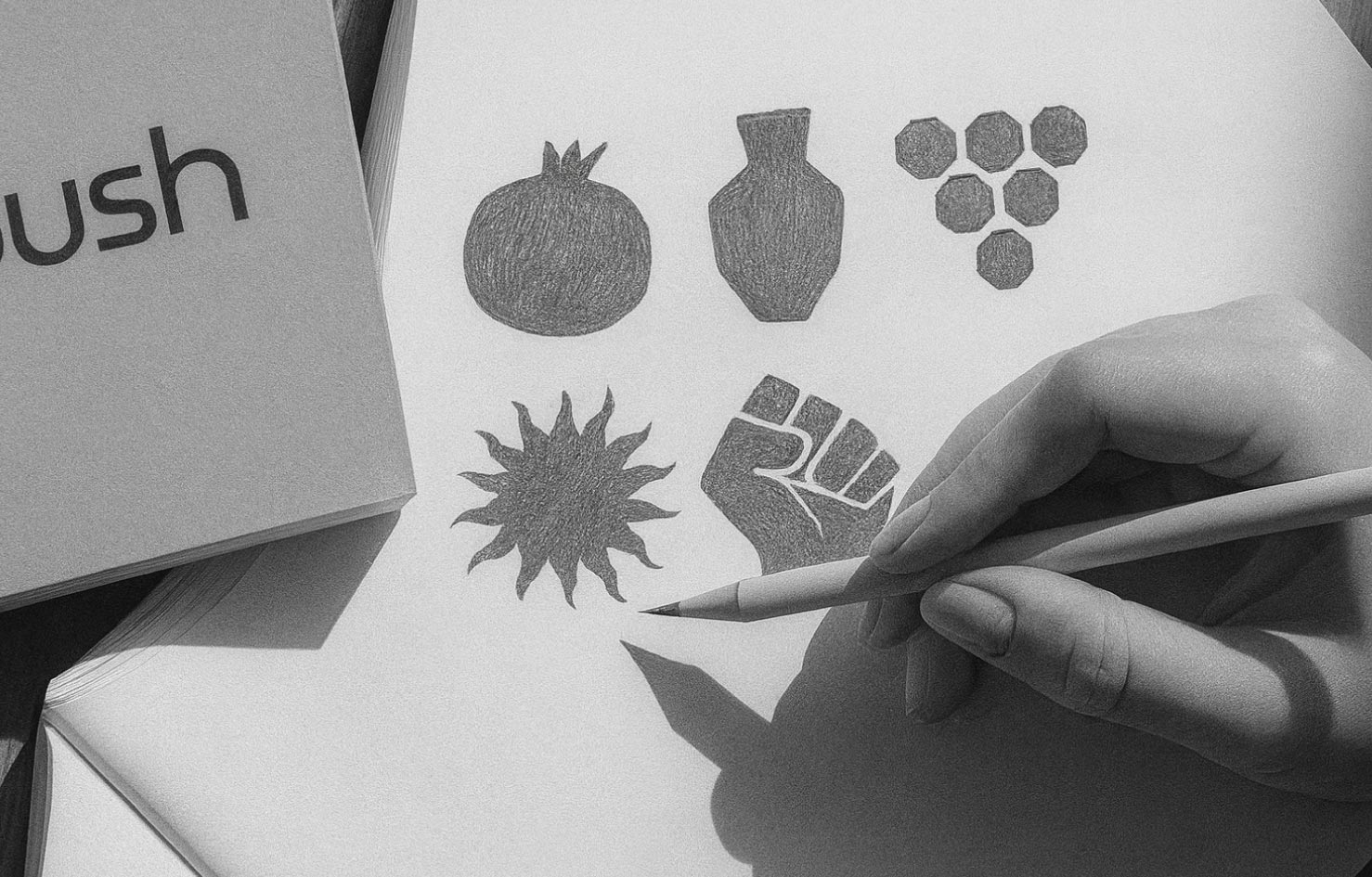
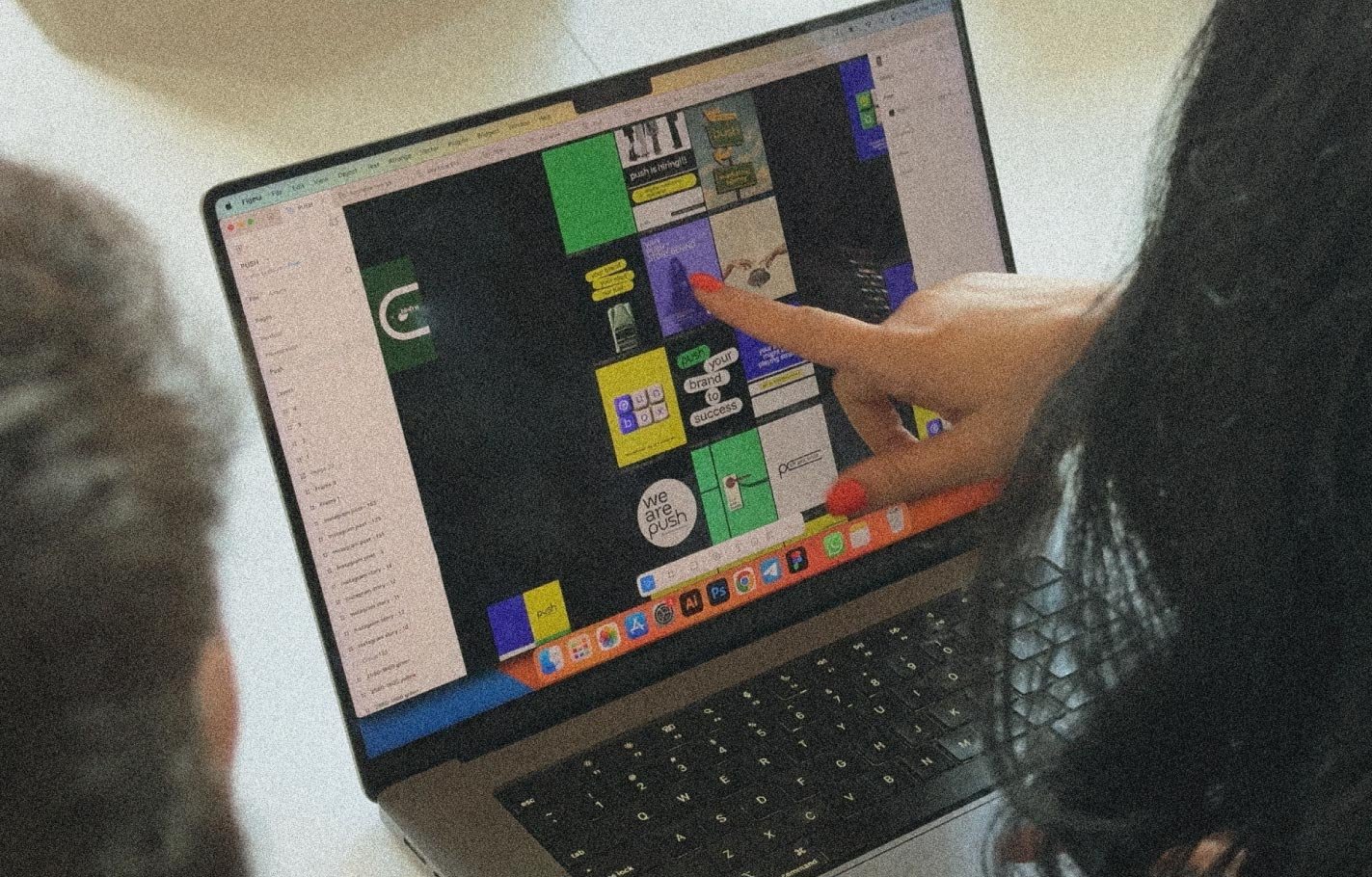
2. lessons from our projects
dearie beauty space – branding through language
we renamed a salon to dearie, a word that feels affectionate in english. but in armenian, “de ari” means come here – a phrase of intimacy and invitation. this linguistic nuance became the soul of the brand. paired with deep green, velvet orange, and beige, the identity reflected calm confidence.
lesson: the strongest brands build emotional and cultural connections, not just visual ones.
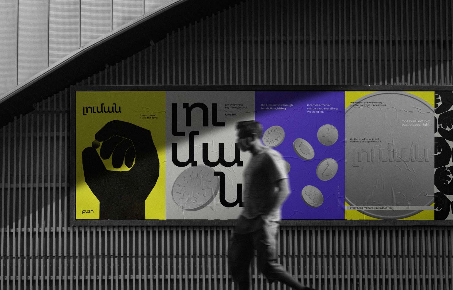
luma – the power of small but deliberate design
with luma, the idea was a small push that changes everything. the brand identity was minimalist but deeply intentional: muted tones, geometric layouts, and typography that reflected quiet strength.
lesson: branding doesn’t have to be loud to be powerful. clarity and intent make impact.
berg development – architectural presence in design
berg wasn’t just about building houses. it was about blending architecture, design, and lifestyle. the brand identity mirrored that philosophy: clean grids, editorial-style layouts, timeless typography.
lesson: when your visual system mirrors your philosophy, you don’t need to explain – people just feel it.
sky solar pro – trust through clarity
the solar industry is full of fake promises. our branding for sky solar pro emphasized transparency: government-backed programs, long-term warranties, bold but simple visuals.
lesson: in industries with low trust, branding isn’t fluff – it’s proof.
3. why strong branding pays off
branding isn’t just aesthetics – it’s a business tool. when done right, it:
- builds trust instantly (a consistent brand feels reliable).
- creates recognition (you don’t just see a logo – you remember the vibe).
- drives sales (people pay more for brands that feel polished and aligned).
- aligns teams (your staff knows what your brand stands for and delivers it).
branding is what makes a salon feel like a sanctuary, a solar company feel credible, and a construction firm feel timeless.
4. how to think beyond the logo
- start with your why – why does your brand exist beyond making money?
- define your voice – how do you talk to your audience? bold? caring? witty?
- map the customer journey – every touchpoint is branding (website, packaging, emails, even invoices).
- invest in consistency – scattered visuals kill trust. aligned systems build it.
conclusion: the logo opens the door, branding makes them stay
your logo is important, but it’s not your brand. it’s the entry point. what keeps people coming back is the story you tell, the way you make them feel, and the consistency they experience across every interaction.
branding is the push that turns a business into a brand – and a brand into something unforgettable.