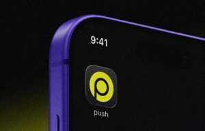
you don’t notice app icons.
until they change.
then suddenly it’s all you see.
your home screen feels wrong.
something looks off.
you can’t explain it clearly, but you feel it immediately.
that reaction is not about design.
it’s about ownership, memory, and control.
and that’s exactly why something as small as a logo redesign can trigger massive brand backlash.
this isn’t a design story.
this is app icon psychology playing out in real time.
the smallest surface with the highest frequency
brands obsess over billboards, campaigns, and content.
but most brands underestimate the most viewed asset they have:
their app icon.
think about it.
an average user sees their home screen:
- dozens of times per day
- in micro-moments
- without thinking
- without context
no ad placement comes close to that frequency.
your app icon is not a logo.
it’s a habit trigger.
it’s:
- muscle memory
- visual shorthand
- emotional familiarity
and once that familiarity is broken, the reaction is immediate.
your brain doesn’t process icons as design
this is where most brands get it wrong.
they treat icons like visual assets.
users don’t.
users process icons like spatial memory anchors.
your brain doesn’t think:
“that’s spotify’s new icon”
it thinks:
“something moved”
that’s a completely different reaction.
because your home screen is not just a layout.
it’s a mapped environment.
and when you change an icon, you’re not redesigning a brand.
you’re interrupting a system people rely on daily.
why even small changes feel aggressive
from a design perspective, many icon updates are minor:
- color adjustments
- gradients
- shape refinements
- visual simplification
from a user perspective, those changes feel disproportionate.
because the brain is not reacting to:
- aesthetic improvement
- design trends
- brand evolution
it’s reacting to:
- disruption
- unfamiliarity
- loss of recognition
this is why digital branding behaves differently from traditional branding.
in physical environments, change is gradual.
in digital environments, change is instant and unavoidable.
you don’t discover the new icon.
you’re forced into it.
familiarity is a form of trust
this is the core layer most brands ignore.
familiarity is not just preference.
it’s psychological safety.
when users repeatedly see the same icon:
- recognition becomes automatic
- interaction becomes frictionless
- trust becomes subconscious
you don’t think about opening an app.
you just do it.
that’s the goal of strong app icon psychology.
and when you change that icon, you’re not just refreshing design.
you’re resetting part of that trust loop.
the illusion of “it’s just a small update”
internally, teams say:
“it’s a small tweak”
externally, users feel:
“why did they change this?”
this gap exists because brands operate in intent.
users operate in impact.
the brand sees:
- strategic evolution
- modernization
- alignment with new identity
the user experiences:
- interruption
- confusion
- friction
and friction, even at a micro level, creates resistance.
brand backlash is rarely about design quality
this is important.
most users are not design experts.
they don’t evaluate:
- kerning
- color theory
- visual hierarchy
they evaluate:
- comfort
- familiarity
- ease of use
so when brand backlash happens after a logo redesign, it’s rarely because:
“this design is objectively bad”
it’s because:
“this feels wrong to me”
and “feels wrong” spreads faster than any design rationale.
social media amplifies micro-frustrations
in the past, icon changes were private experiences.
now they’re public conversations.
one tweet becomes:
- “why did they ruin this icon?”
then it becomes:
- memes
- screenshots
- side-by-side comparisons
- nostalgia threads
suddenly a small update becomes a collective reaction loop.
this is where digital branding becomes volatile.
because reactions are no longer isolated.
they’re networked.
people don’t just use apps—they personalize them
your phone is not neutral.
it’s curated.
people organize apps:
- by frequency
- by color
- by category
- by emotional importance
some even design their home screens aesthetically.
so when a brand changes its icon, it’s not just changing branding.
it’s interfering with personal systems users built themselves.
that’s why reactions feel stronger than expected.
it’s not just your icon.
it’s their environment.
the hidden contract between brands and users
there’s an unspoken agreement in app icon psychology:
brands promise consistency.
users give attention.
when that consistency breaks without warning, users feel:
- disconnected
- disoriented
- slightly annoyed
and that annoyance turns into:
- tweets
- comments
- negative perception
not because the change is big.
because the relationship was interrupted.
redesigns signal more than visuals
users don’t analyze design deeply.
but they do interpret signals.
a new icon can imply:
- a new direction
- a new product focus
- a new audience
- a shift in brand identity
even if none of that is true.
this is where logo redesign becomes strategic risk.
because perception doesn’t follow intention.
it follows interpretation.
why brands keep changing icons anyway
if backlash is predictable, why do brands still do it?
because internally, change feels necessary.
brands chase:
- modernity
- relevance
- trend alignment
- internal excitement
staying the same feels like stagnation.
but here’s the reality:
users don’t experience your brand evolution daily.
they experience your brand as a constant utility.
and utility prioritizes:
- clarity
- consistency
- speed
not novelty.
the tension between evolution and recognition
this is the real challenge in digital branding.
brands need to evolve.
but recognition is built on consistency.
so every change creates tension between:
- being current
- being recognizable
the best brands don’t avoid change.
they control the pace of change.
gradual change vs forced change
there are two ways to redesign:
- gradual evolution
- sudden replacement
gradual evolution:
- preserves recognition
- feels natural
- reduces backlash
sudden replacement:
- creates contrast
- triggers attention
- increases risk
most app icon backlash comes from the second.
because contrast makes change visible.
and visible change invites reaction.
the role of color in app icon psychology
color is often the most sensitive variable.
users don’t remember exact shapes.
they remember:
- color blocks
- visual weight
- contrast
change the color, and recognition drops instantly.
that’s why even small gradient updates can feel massive.
because color is not decoration.
it’s identity shorthand.
why “better design” doesn’t matter immediately
design teams often improve:
- clarity
- scalability
- modern aesthetics
but users don’t reward improvement instantly.
they reward familiarity.
over time, new designs can become accepted.
but in the short term, even objectively better designs can feel worse.
because they haven’t been learned yet.
adaptation always happens—but not quietly
here’s the interesting part.
most users adapt quickly.
within days:
- recognition returns
- habits rebuild
- friction disappears
but the conversation doesn’t reflect that.
because people don’t post:
“i got used to it”
they post:
“i hate this”
so perception of backlash often feels bigger than actual long-term impact.
but that initial reaction still matters.
because it shapes narrative.
narrative is part of branding now
in modern marketing, what people say about your brand matters as much as what you say.
so when a logo redesign triggers:
- complaints
- memes
- criticism
that becomes part of your brand story.
even if temporary.
this is why icon changes are no longer just design decisions.
they’re communication events.
the real mistake brands make
the mistake is not changing.
the mistake is underestimating the impact of small changes.
brands assume:
small change = small reaction
in reality:
small change + high exposure = big reaction
because frequency amplifies everything.
what smart brands do differently
they don’t just design.
they anticipate behavior.
they consider:
- how often users see the icon
- how quickly recognition happens
- how much change is acceptable
- how social media might react
they don’t just ask:
“does this look better?”
they ask:
“how will this feel at scale?”
the future of icon design
icons are becoming more dynamic.
we’re already seeing:
- seasonal changes
- interactive icons
- context-based visuals
but this increases complexity.
because flexibility reduces consistency.
and consistency is still the foundation of recognition.
so the future challenge is clear:
how do you stay dynamic without losing identity?
bottom line
a small icon change is never just a small change.
it affects:
- recognition
- habit
- trust
- perception
logo redesign at the icon level sits at the intersection of:
- app icon psychology
- digital branding
- user behavior
and when brands ignore that, they trigger brand backlash they didn’t expect.
because users don’t interact with brands occasionally.
they interact with them daily.
and daily interactions create sensitivity.
push it further
before changing your icon, don’t just review the design.
review the behavior.
ask:
- how often do users see this?
- what habits are built around it?
- what happens when recognition breaks?
- what conversation will this create?
because in modern marketing, the smallest surfaces carry the biggest weight.
and the brands that win are not the ones that change the most.
they’re the ones that understand when change actually matters.
push your credibility
push your positioning
push your brand beyond